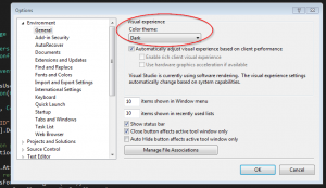
Development and the Dark Visual Studio Theme
I have been using the standard Visual Studio theme ever since I started using the IDE. I have always found it to be visually consistent and usable.
However, as the years continue to go by, I have found the standard Visual Studio theme increasingly harder to read. Especially with the larger sized monitors we are using nowadays. So I have started using the "Dark Theme" which seems to be easier to use at lower resolutions.
 But I have found a problem. If you use the normal "Aero" Windows 7 theme, the cursor seems to be hidden when you move over the code window in Visual Studio.
I found a way to fix this. Just follow these steps:
- Open Control panel
- Open Appearance and Personalization
- Open Personalization
- Click Change mouse pointers. That will open this window:
- Select the Scheme called – Windows Black (system scheme)
That should make the cursor a little thicker and also brighter as you move around your code window.
Til next time...
